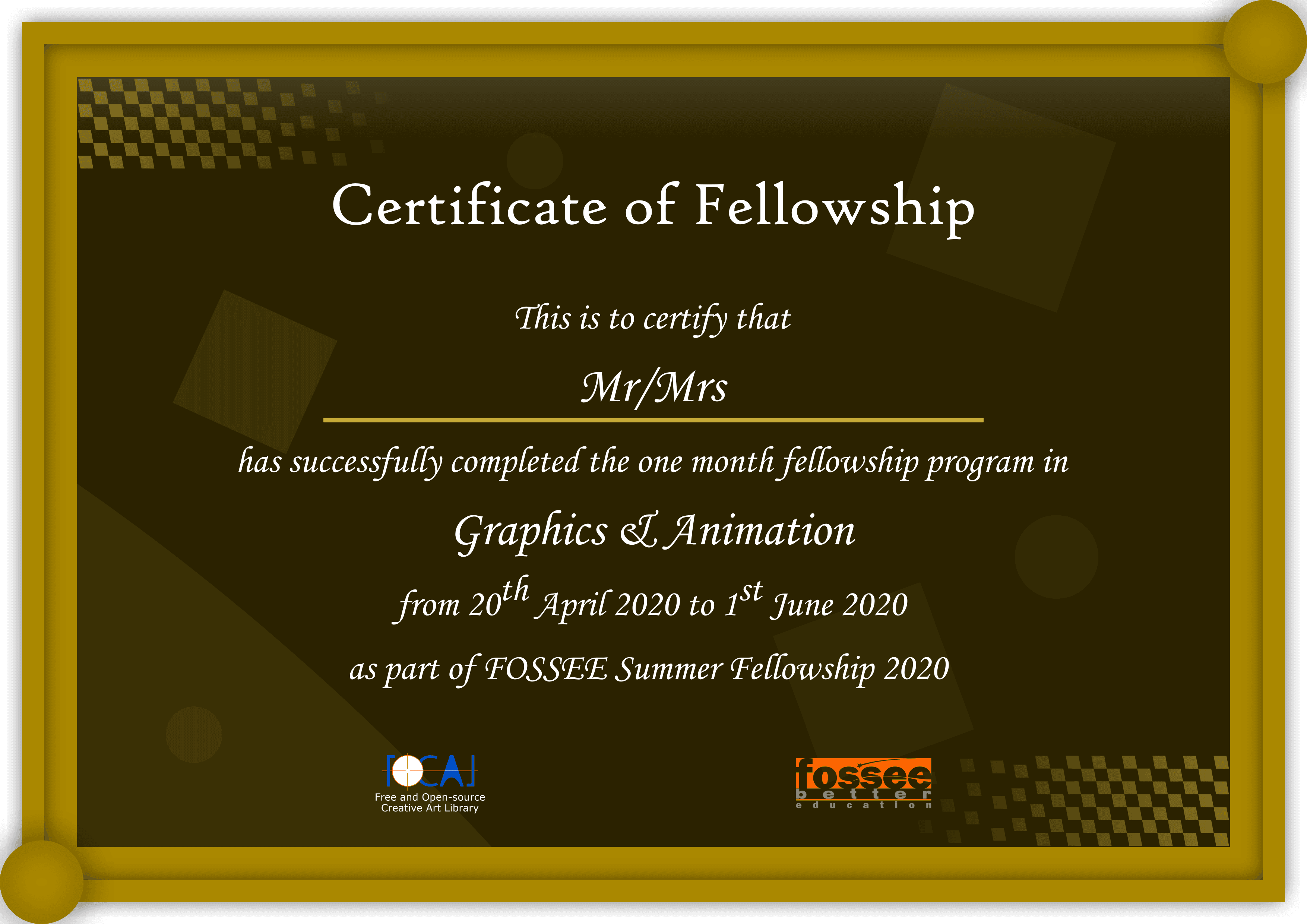
Fellowship Certificate Design
2020
Graphic Design, Branding
About This Piece
This project taught me one of the most valuable lessons in design: Context is King.
The Proposal
For the FOSSEE Summer Fellowship, I was tasked with designing a certificate for graduates. I wanted it to look expensive. I went for a dark, rich background with gold accents—something that screamed "Premium."
The "Failure" (and the Lesson)
It wasn't selected. Why? Because while it looked "premium," it didn't look celebratory. It was too dark for a joyous academic achievement.
- The takeaway: A "good" design that misses the emotional mark is a bad design.
- The outcome: I uploaded it to the FOCAL library anyway, because hey, maybe someone needs a moody, mysterious certificate?
Technical Specs
- Tool: Inkscape v0.92.
- Style: Serif typography, Gold gradients, Dark mode aesthetic.
Gallery
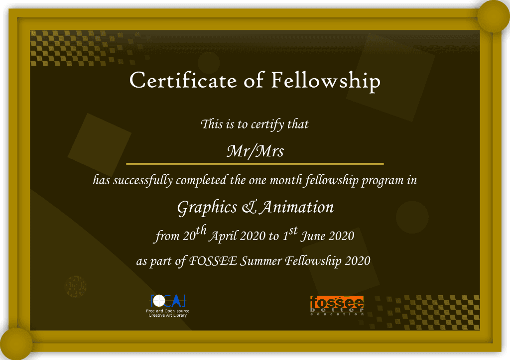
Detailed view of the certificate layout and typography.
Need a creative project like this?
I help businesses and individuals turn complex ideas into refined, high-performance solutions. Let's discuss how I can help with yours.